

LISBON SUMMER OLYMPICS
LISBON SUMMER OLYMPICS
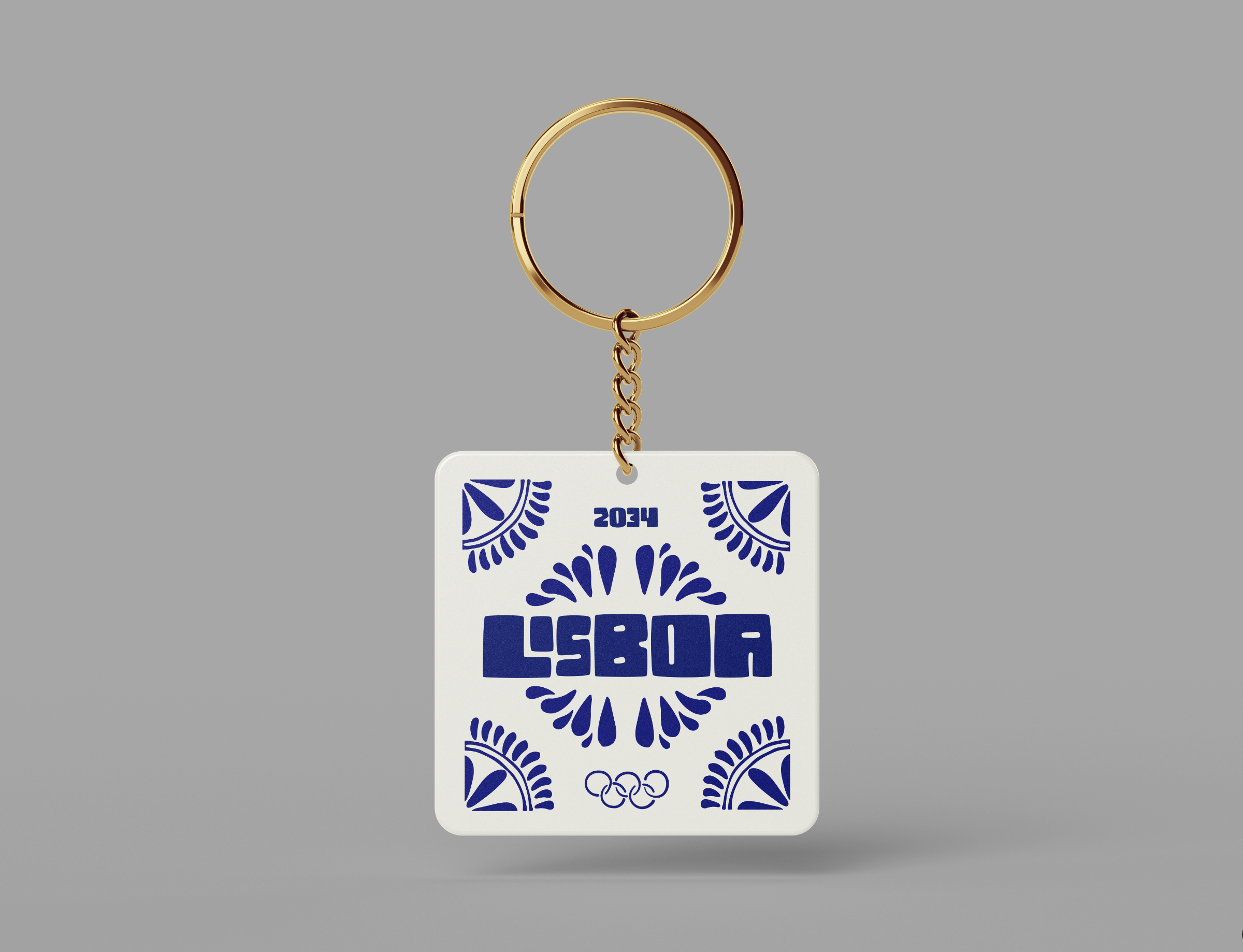
Lisbon Summer Olympics 2034
Lisbon is renowned for its vibrant culinary scene as well as its influential fashion, characterized by a blend of modern chic and classic elegance. Lisbon’s artistic flair is evident in its lively street art and historic galleries, while its architecture spans from stunning Manueline structures to contemporary designs.
A key element of the visual identity was the azulejos, the iconic Portuguese ceramic tiles known for their intricate patterns and bright colors. These tiles, which adorn numerous buildings and streets throughout Lisbon, served as a symbolic representation of the city's artistic and historical richness. By incorporating the distinctive patterns of azulejos into the Olympic branding, the project vividly captured Lisbon’s cultural vibrancy and its dynamic spirit of celebration and innovation.
Primary Logo and Secondary Logo
Logo


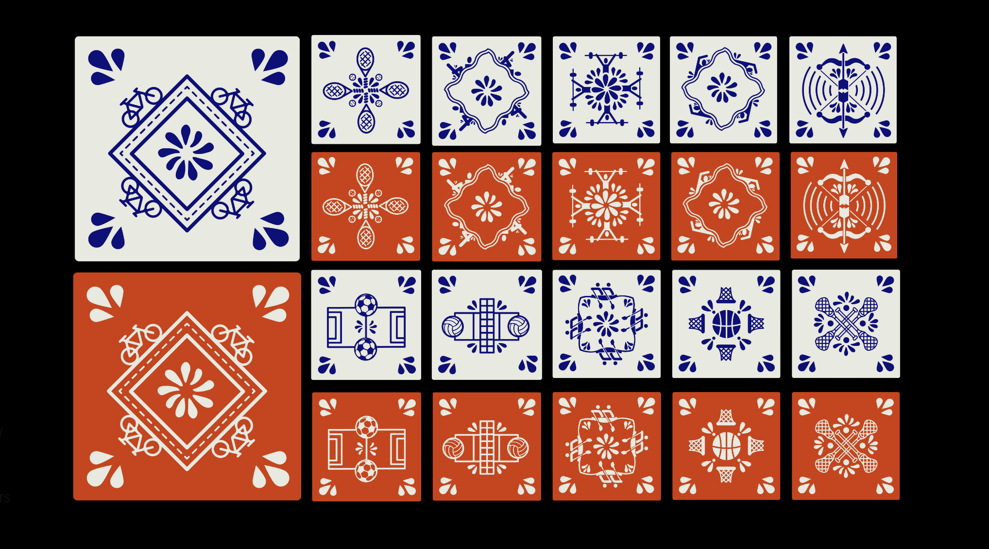
Primary and Secondary Pattern
Pattern


Dual color pictograms for various events
Pictograms


Parallel Reality Ticket Kiosk

Every pixel on the LED board can emit different colored lights in thousands of different directions. Every light pattern is unique to each ticket holder, allowing them to see a completely individualized message on the board. Thus, you and the person standing right beside you will see completely different messages.

The parallel reality ticket kiosk uses existing technology currently used in the Detroit Airport. When you scan your ticket upon entry, your ticket is associated with your location in the arena lobby. Your person is represented by a group of pixels, no facial recognition is used.
Team
Claire Snyder (AD/XD), Mia Kasper (AD), Camber Barnett (AD)